Showing posts with label portraiture. Show all posts

Sunday, 13 March 2016

Painting Dark Against Dark

I’m working on a commissioned portrait at the moment that is proving tricky. The sitter is dressed in a black suit and Masonic regalia. This is to be a formal and traditional portrait, so I’ve been looking at hundreds of the things for ideas, and have decided I definitely want a dark background. I’ve reached the stage where I’ve done all the under-painting and have had some success in that it certainly looks like the sitter, the pose is good, and the regalia is taking shape. The problem is the black suit. The colour I’ve chosen for the background is a very dark green, and whilst in daylight you can see the change from black to green, by electric light the distinction disappears completely. I’ve tried lightening the background a little by adding a yellow glaze, but that still gets swallowed up in electric light and is in danger of looking garish in daylight. The suit itself is matt black, so I can’t use the tricks I might use if it were black satin with all the light reflections. I haven’t fallen into the trap of using black paint at least, though I’ve come perilously close with a bit of Payne’s Grey, a colour I rarely use.

To try to sort this problem out, I took myself yesterday to the Bowes Museum, which is the nearest art gallery to my location likely to contain portraits that might help. There are formal paintings closer to home – Bishop Auckland Castle has plenty of paintings of past Bishops – but the problem there is the really good portraits look in desperate need of a clean so it’s hard to see what the artists did to solve the problem, and the more modern ones that don’t need cleaning tend to have light backgrounds, which is not the effect I’m after.

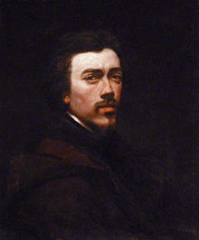
There are some fantastic portraits in the Bowes. My favourite is an 1874 self portrait by French realist François Bonvin. He’s wearing very dark clothes – so dark you can barely make out whether it’s an overcoat or monk’s habit or what – has dark hair, and has painted himself against a very dark background. This means you see the face and only the face because the rest virtually merges together. This ought to matter, but in this particular painting it absolutely doesn’t, so it shows beyond a shadow of a doubt that in certain circumstances a background/clothing merge can be made to work. It still makes me nervous of attempting such a thing. I am no Bonvin. 


Another painting that does something similar, though has more light in it generally is a fabulous portrait of Lord Harry Vane by George Frederick Watts. Unfortunately I can’t find that one on the internet so can’t show it. He is wearing a dark suit and one of his shoulders almost merges into the background, but he has a shock of white hair and there is other brightness in the picture (a medal, his white shirt) so there’s more of a sense of balance, if less drama, than the Bonvin. The suit itself, though clearly black, is painted in shades of grey, but where it meets the background there is still virtually no distinction. It works because the viewer knows where his shoulder must be, so sees it anyway. It’s not a trick of the eye so much as the use of logic and seeing what you know must be there.

The Bowes is also currently hosting a selection of photographs by Robert Mapplethorpe, and some of these do exactly the same thing – the tonal difference between a shoulder in a dark shirt and a dark background can be incredibly slight, but the eye still sees it and knows exactly what it’s seeing.

So maybe the answer is not so much in the tonal values as in the draftsmanship. If the suit is well enough painted and clearly shows how the fabric forms around the body underneath, then a major distinction in tonal values is not required. The viewer’s brain will work it out. This puts the onus on me as the artist to get the suit right. I must stop worrying so much about the distinction between the edge of the suit and the dark of the background and work more on suggesting that there really is a solid body underneath that thick black fabric. If I can do that, the rest will take care of itself.

That’s the theory, anyway. The next few months of painting will see whether I can pull it off. There is no hurry for this one to be finished, luckily, so I have the luxury of working in oils rather than acrylics and being able to let glazes dry completely – also I have ready access to the sitter whenever required, so I don’t have to rely on guesswork.

The next problem will be the regalia. The trick there is going to be how to suggest or the detail without actually painting it in, because I’m no miniaturist so am absolutely not going to start working in a brush with one squirrel hair. The trick here is to see how the light catches the braid, and for that there are plenty of artists to show me the way from Gainsborough to Manet – but that’s a problem for another day.   

Thursday, 10 March 2016

Hairy Arms and Icebergs

I’ve never much wanted to read Hemingway, having always been put off by the macho image and the bullfighting and hunting, etc. Didn’t think someone like that would have anything to say to someone like me. Then on one of my regular charity shop browses for bundles of books to keep me going, I came across ‘A Farewell to Arms’ and thought at 75p I might as well give it a go. It was entirely opposite to my expectations. I warmed to the central character, I found much of it tender and touching and the violence was never glorified in any way – quite the reverse. I had a few weeks of wishing I’d discovered him earlier, wishing he turned up in charity shops more frequently (I have difficulty affording new books at the moment) but then I had a brainwave – birthday coming up: ask Mother for some Hemingway. So I did, and she duly obliged with three more novels. I’ve just finished ‘Fiesta’ and absolutely loved it, even though a good proportion of the book is in Pamplona, there are bulls, they die – though one manages to gore a man to death in passing. And you know what? I get it. I get what Hemingway was saying about bullfighting, why it’s there, what it means. I get it in the spirit of the literature. I am not someone who would ever go to a bullfight, and I would happily sign petitions and demonstrate against the vile ‘sport’ – but in terms of the book, I absolutely get it.

A similar thing happened to me in my teens when I was going through a John Masters phase. I’d read a lot of the Indian novels, but then came across the Spanish one: ‘Fandango Rock’ which is very much a bullfighting novel. I hated the idea of bullfighting, but Masters really understood what it was all about and took it to the heart of his novel and made it work. It’s years and years since I read that book, and I possibly won’t read it again ever because I think one outgrows Masters at some point. He is very much an author to be read in one’s teens; fabulous storytelling, great characters, authentic settings, and sex scenes that are erotic rather than cringe-making, so he’s perfect when you’re fifteen or sixteen. He is also very full on with his prose – it’s rich and gorgeous. Very different to Hemingway, with his iceberg style – and that doesn’t mean he’s cold. Far from it. It’s referring to the fact that most of what is really happening is under the surface. Hemingway was a journalist first, so he reports what happens in a clipped and clear way. It’s left to the reader to work out what the real story is, and there will be much, much more beneath the surface than above, hence the iceberg analogy. He’s supposed to have pretty much invented this, apparently. I disagree. I reckon if anyone invented it, it was Jane Austen, because she does exactly the same thing. She tells you what people said and what happened. She doesn’t do a Bronte and delve deep into their emotions and pour them out gushingly in purple prose. Now, I love Charlotte Bronte in particular, but I sometimes find her completely unreadable because she will explain every last feeling in as much detail as she possibly can. Austen and Hemingway don’t do that, and the result is you are more likely to choking back the tears at the end of ‘Persuasion’ or ‘Fiesta’ than you are at the end of the infuriating ‘Villette’, and that’s because there is SO much going on underneath, you are left exhausted, whereas you feel with Charlotte Bronte, she’s the one who’s left exhausted at the end of the novel rather than the reader.

I have a thing I do with authors I love – unless they are hideously ugly, and I can’t bear to look at photos of them, I like to draw their portraits. It’s partly a sort of ‘thank you’ letter to them for the books, and partly self-indulgence, and that irresistible strange alchemy that happens when you study someone’s face and draw them. By happy coincidence, we were doing portraits in my art class this morning. (By ‘my’ I mean the one I attend. I don’t teach it. Wouldn’t know where to begin.) So I thought, yes! Hemingway! Today’s the day. Ideally when I draw someone who I haven’t met, I watch film of them on YouTube and make a composite drawing from various images I find online, but I was short of time so thought I would simply pick a photo I liked and work from that. There’s a great one of him actually engaged in writing. I thought I’d get the basic outline in before I went to my class so that I wouldn’t waste time there trying to get it right. Glad I did, because the method we were being taught this morning would have been incredibly difficult to get right for me – it involved careful measurement and ratios and all that stuff. Now, for me, there are three ways to get a likeness. Best – you trace it. Next best – grid it. Third best – entirely freehand. I wouldn’t even consider doing the careful measurement of, say, an eye, and then seeing how many eyes fit into the distance between the right nostril and the Adam’s apple. So I listened to the teacher giving the explanation and demonstration of this method, and her encouragement to follow it, and as usual, I went my own way, and was thoroughly relieved I’d thought to trace the outline first so I knew my proportions were broadly correct. Then it was simply a question of sitting down with my favourite Conté pencil and getting on with it. This sort of thing takes far longer than you expect, and men with hairy arms – well, you can get locked into those hairs. I have a thing about men with hairy arms. I am very fond of such things. I spent far too long enjoying his arms – but I did also get his eyes, glasses, head, nose, mouth, bit of beard, etc, broadly shaded. Still a long, long way to go. The question is, will I be able to resist finishing this one off until next Thursday? We have another portrait session then to carry on with what we started this week. If I succumb to temptation, which is highly likely, I’ll finish him on Sunday if not before, and then I will have to think of someone else to draw. Actually, that’s probably not too much of a hardship. I could always do him again.

I have become ridiculously fond of Ernest Hemingway. 


Thursday, 3 March 2016

Drawing Christine

I’ve recently been working on a set of portraits of Christine Keeler. I wouldn’t normally do more than one picture of somebody I don’t know, but I did the first, and Fionn Wilson, the artist who is masterminding the Christine Keeler project, suggested that a set of three or four might be a good idea, so I though, yeah, okay. She didn’t want copies of photos, which is absolutely fair enough. Anyone with rudimentary drawing skills can copy a photograph, but think of your own passport photos. Do they actually look like you? Highly unlikely. Sometimes there’s no choice but to work from a photo, but even if you can’t get a sitting with the person you’re drawing, there are other ways, especially if they’re someone in the public eye like Keeler. I went to that font of all moving images: Youtube, found a documentary with plenty of video, and watched until I got more of a feeling of what she really looks like, until I started to feel that any image I produced might be in with a chance of getting under the skin and showing something of the real person rather than the superficiality of the outer features. The first portrait I did had her resting her chin on her hand, looking downwards, serious, the next also had a serious expression, so in the third I wanted to capture, if not exactly laughter, something akin to amusement/bemusement. In that one she looks as if she’s saying, ‘I can’t believe you really just asked me that question’ which must have been something she often thought as she was being interviewed.  I think I managed it okay, because each time I drew her I felt I got closer to the real person, and each portrait looked more like her in some inexplicable way. She is someone I am unlikely ever to meet, but the more I draw her, the more I want to meet her, and this is often the case with portraiture, because there is something weirdly intimate about staring intensely at someone’s features when they can’t look back. 


I like to work relatively quickly, so these drawings took no more than an hour or two to complete. I’m going to make a note of the specific technique here, because the way I draw changes every few months and I’ll want to look back and check how these ones were done.

First of all I do a very careful line drawing using a sharp Derwent Onyx pencil. This is just outline to make sure the proportions are spot on, concentrating on eyes (easy), nose (okay) and mouth (often surprisingly difficult). I also indicate dark areas, not with shading, but simply by encircling them. It means the drawing looks like the plan for ‘painting-by-numbers’ at this point, but that’s fine. The guidelines are vital, and once they’re there I can continue with some confidence. Then I change medium – I have a fat and chunky Faber Castell 2B graphite stick, and I use the flat end to block in the tones. This is still very pale – it calls itself 2B but it feels far harder. Once I’ve done the blocking in, I have a ghost image, but it already looks recognisably like the person. The final medium change is to Conté, specifically a well-sharpened Pierre Noir 2B conté pencil. I love this type of pencil because it is intensely matt black, something you can never achieve with graphite however soft because of the sheen you inevitably get which makes it so hard to scan or photograph, or even see in some lights.

While the pencil is still very sharp (and I use a professional mechanical sharpener to ensure this) I draw the eyes in as much detail as I can manage, though as conté is by its nature thick and crumbly, this is always going to be an approximation. I work lightly at first. The real darks will come later. Once the eyes and eyebrows are accurate, I work on the nose, then with extreme care, tackle the mouth. I avoid erasing if at all possible, and the rubber only comes out if I make an accidental fingerprint on a bit I want to remain white – because the whites are vitally important. Highlights on cheeks and nose stay as pristine white paper, which incidentally is ordinary photocopier paper as often as not. I like its smoothness, and it takes the various pencils extremely well. By this time the pencil is blunted, and I can start working on the tones of the cheeks, under the chin, bags round the eyes, and so on. Once they’re roughed in, I set to work on the hair, because if the hair is very dark, for example, it’s going to have a major effect on the balance of the tones overall so I need to get that in as soon as possible. From this point, it’s a question of gradually building up the darks so that the underlying skeletal structure is there – and of course the personality, because this shows in the precise angle of the mouth (which is why the mouth is so difficult) as well as any hollowness in cheeks, and in older people, the precise way in which wrinkles and laughter lines have formed.

Conté is imprecise, which is why I love it. I’m not going for photo-realism, ever, or I would use all the grades of graphite available and end up with something incredibly smooth. However, if it’s too rough, then the subtlety is invisible, and faces are nothing if not subtle, so the very last thing I do is the blending. Some people swear by paper stumps and suchlike, but I find with conté, to get absolute control, the tip of my little finger is best. And I use it vigorously, picking up black dust from the darkest areas to rub into the mid-tones, and I rub and rub away (conté is very forgiving) until the gradations of tone are to my satisfaction but it’s still looking lively because of the extreme contrasts between the darkest and lightest tones, and my earlier rough and scribbly drawing. I end up filthy, and I’ll have sharpened away half the conté pencil, but with any luck, the whites on the paper are still bright and clean. I scan it as quickly as possible at this point, as the chances of damage are high. For preservation, I tend to put it straight into a pound shop frame, which I find is much safer than a plastic wallet, where it might move about and smudge. If it’s any good, I can always re-frame it at a later date.

So that’s what I’ve been doing in the last few days. Three down, one to go. Today, however, I’m giving myself a self-indulgent break and intend to draw Jeremy Brett as Sherlock Holmes, because I’m a huge fan, and his is a face I’ve never tackled. Then I’ll go back to Christine afresh, and complete the final portrait.